Branding
BRANDING
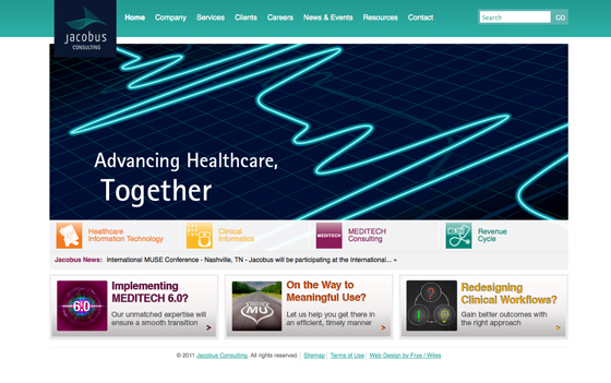
Jacobus Consulting Offering Area Icons
Jacobus Consulting is a leading healthcare IT services firm headquartered in the greater Los Angeles Area, and the company has grown rapidly to now possess clients nationwide. Along with their identity redesign and collateral development, icons needed to be created to showcase their offering areas in print & web applications.
List of icons shown, in order: Healthcare Information Technology; Revenue Cycle; Clinical Informatics; MEDITECH; Health Information Management; Physician Advisory Services; Healthcare Advisory Services; Quality Driven Organization; Education and Training.
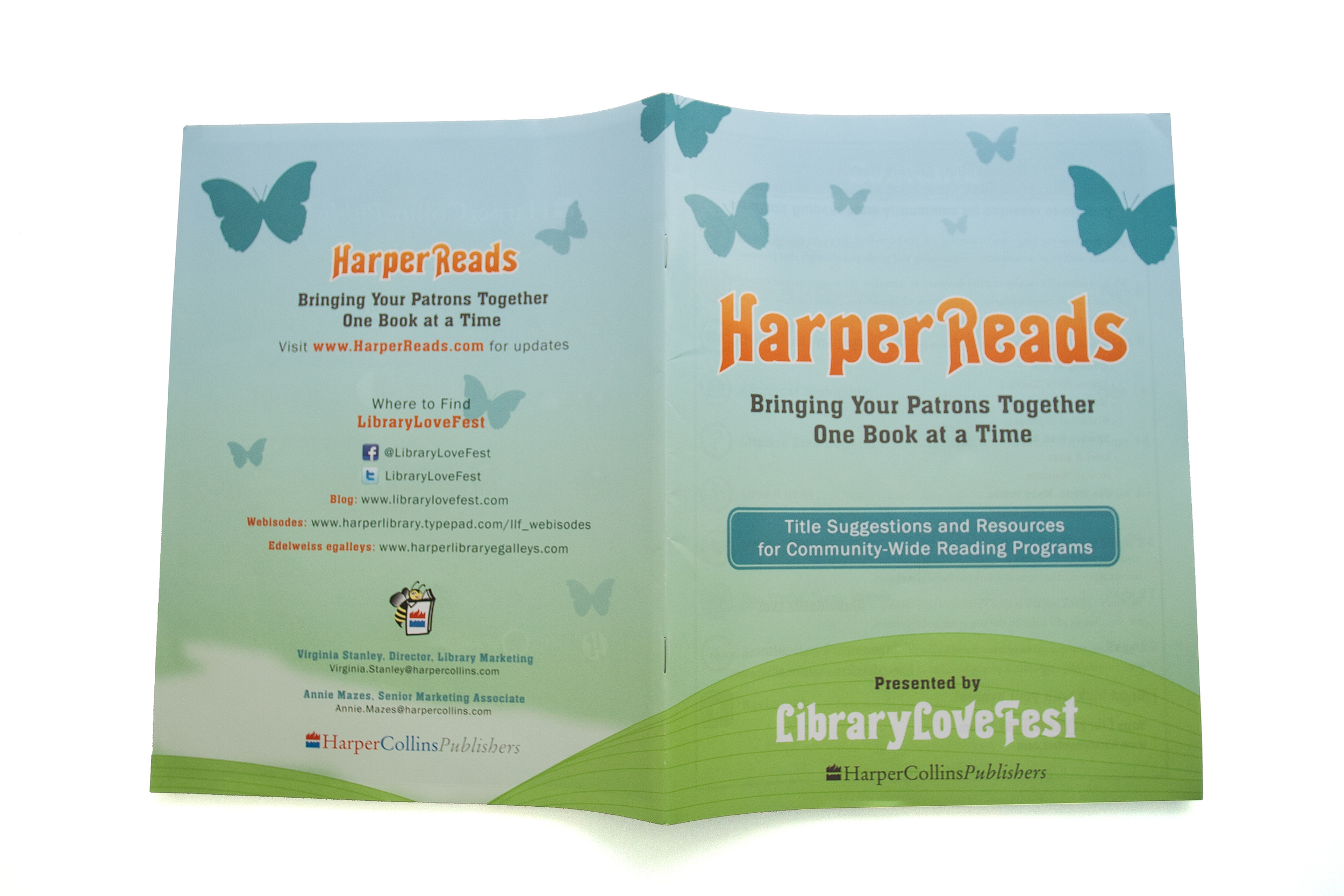
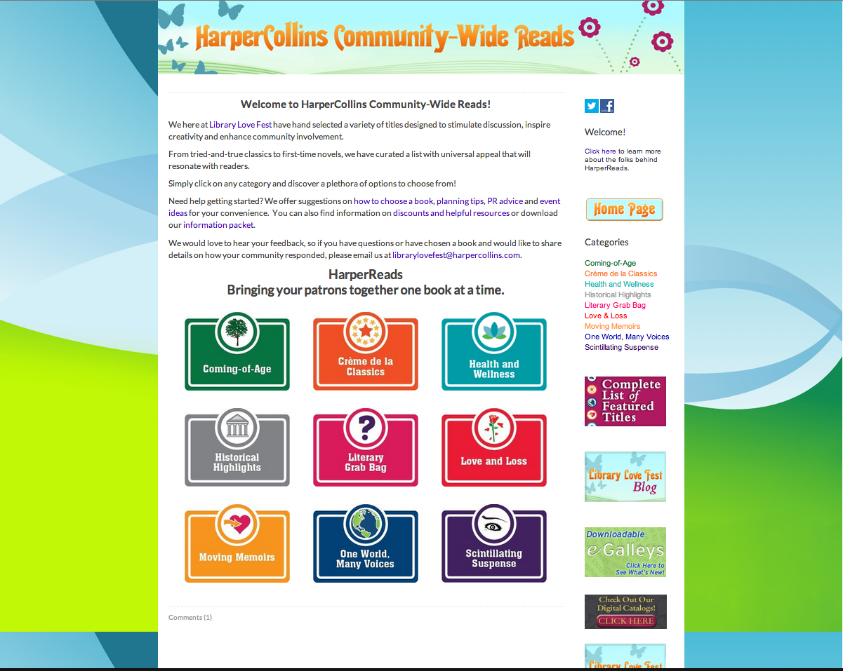
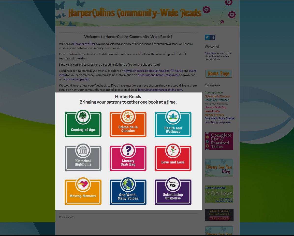
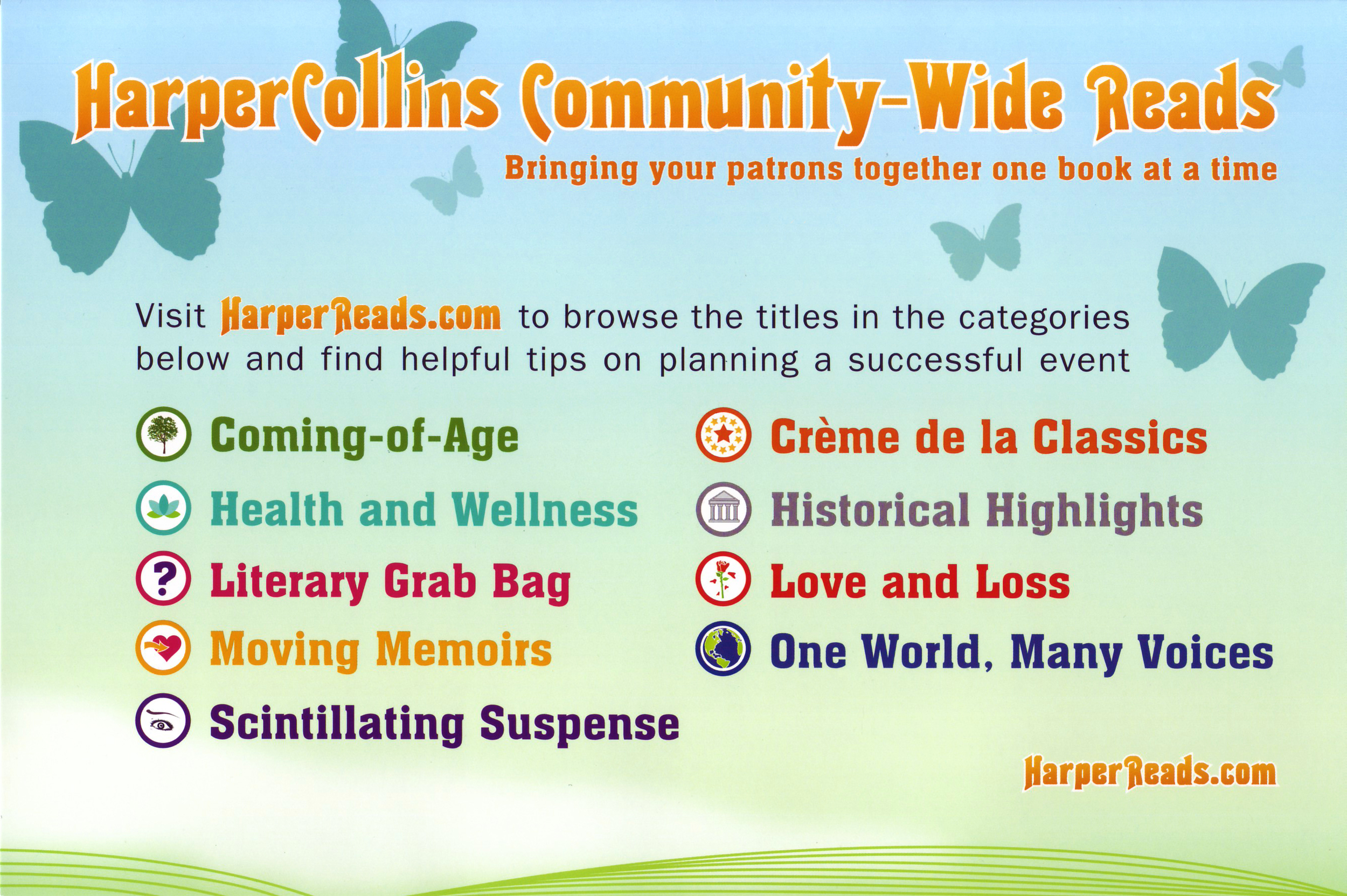
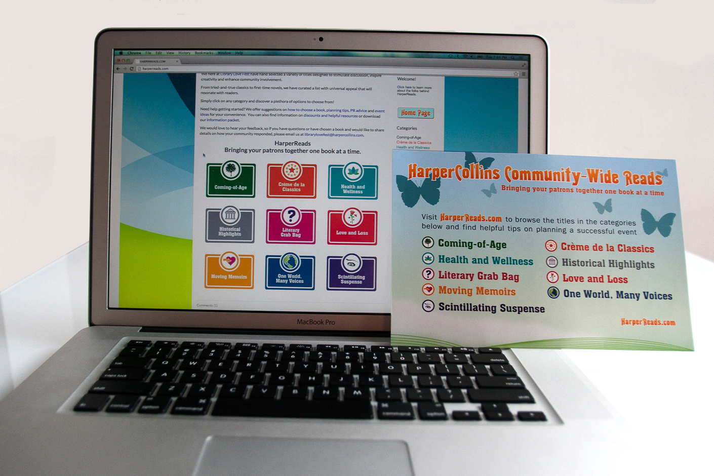
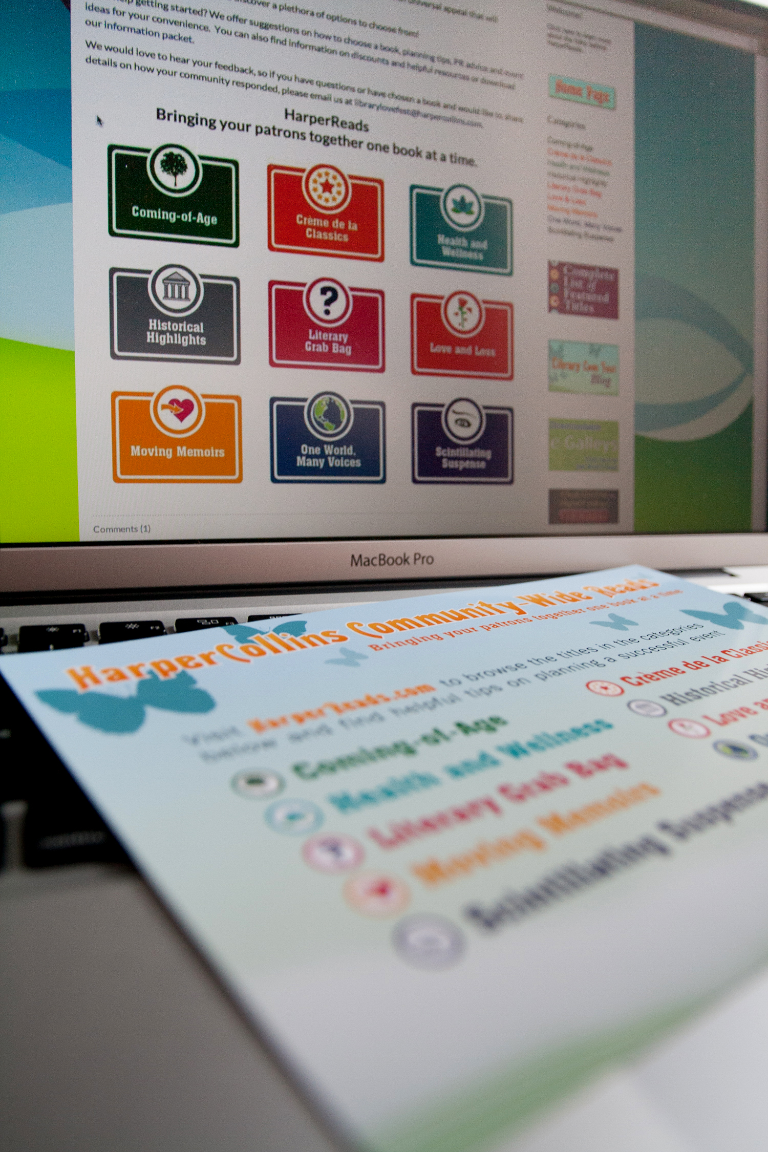
HarperReads Branding
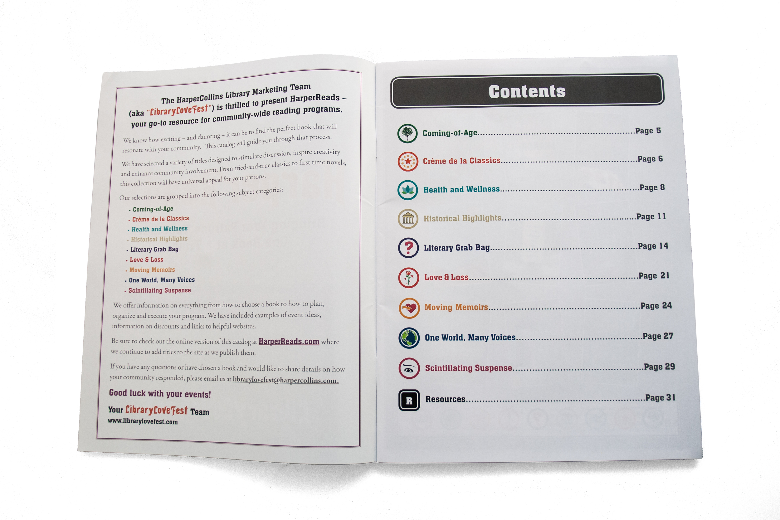
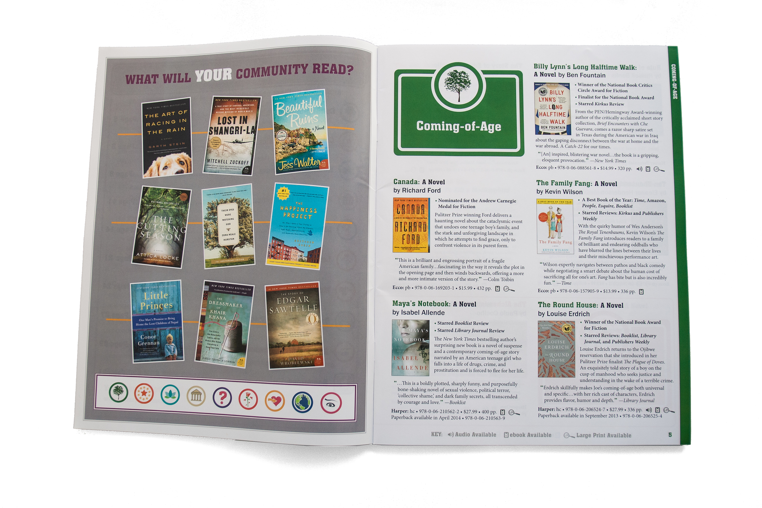
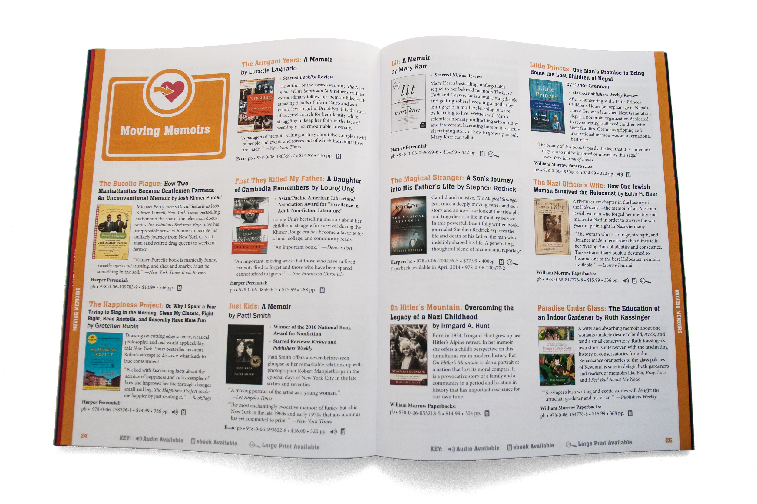
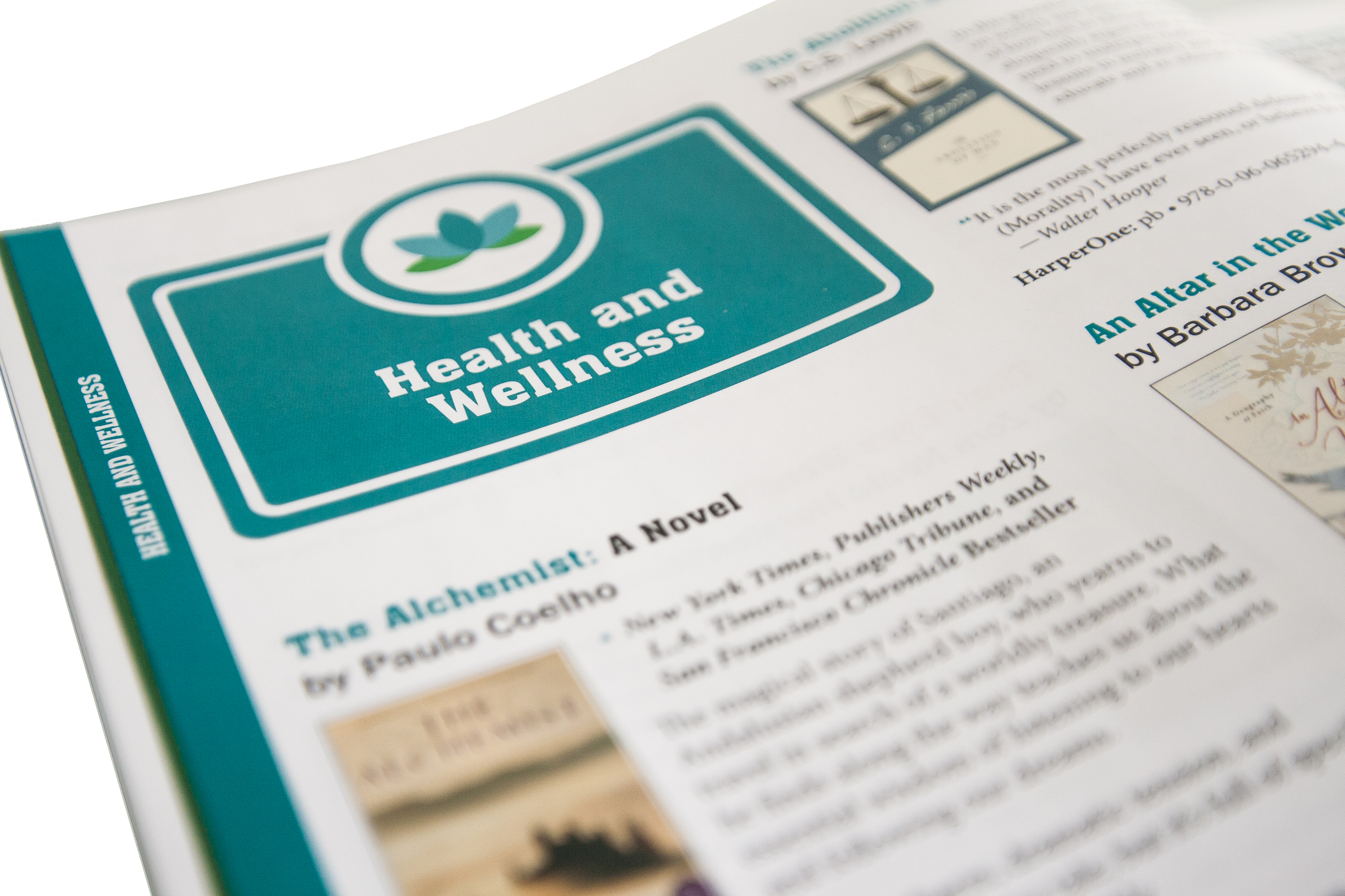
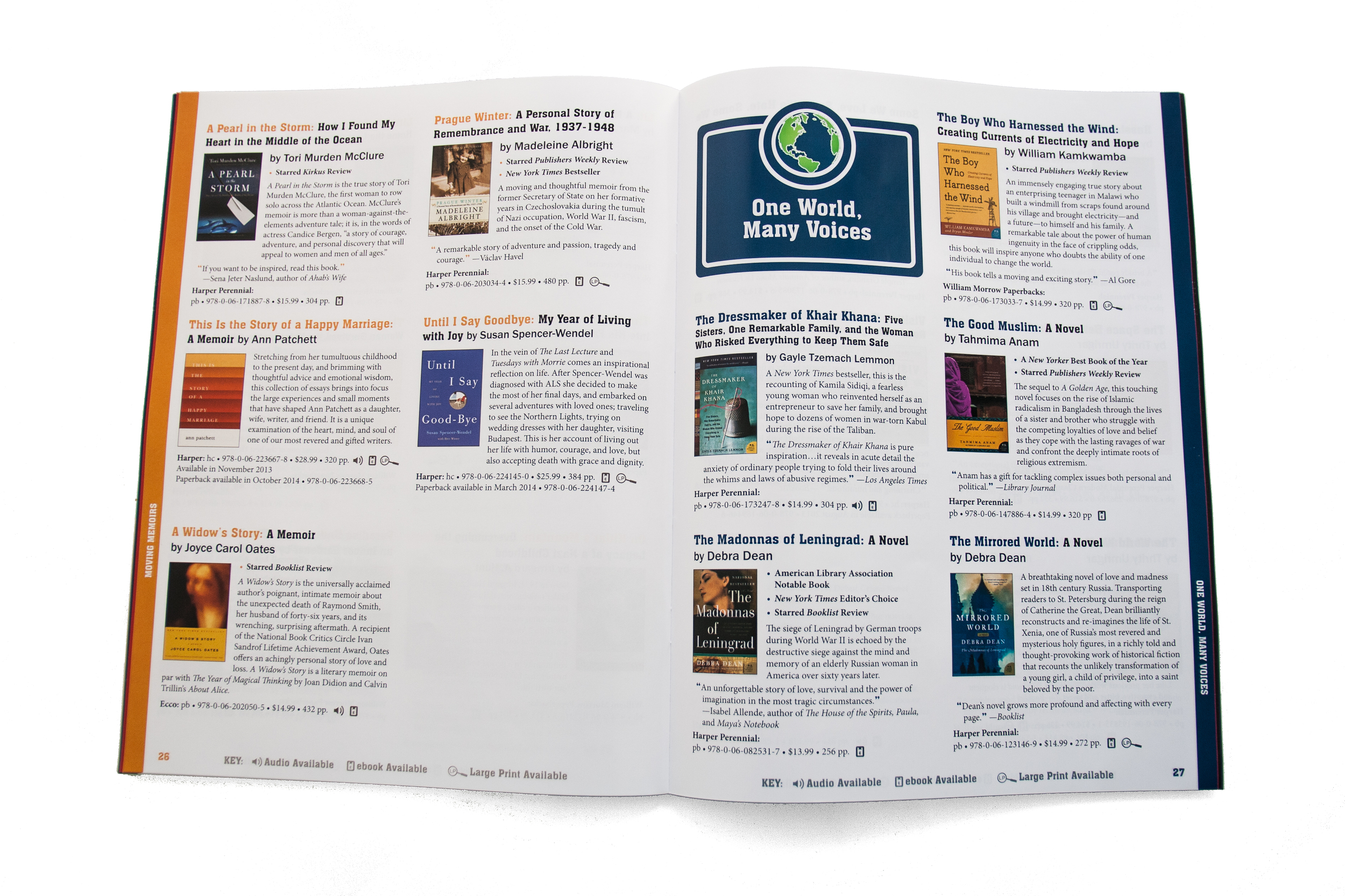
The HarperCollins Publishers Library Team created a new program called "HarperReads," which is a new website with book selections and resources for those wishing to start or supplement a shared reading campaign or book club. The program is under the previously existing "Library Love Fest," which has a branding of its own. With the nine given categories of book selections, there was a need to create an overall brand for the reading program that could stand alone yet still stand under the existing "Library Love Fest" branding. For each area, a custom symbol was developed as well as a placeholder template that could be adapted for reuse across many formats. Typography was carefully selected to complement the existing branding as well. The result is a flexible, legible, and adaptable branding solution. A postcard was also designed for distribution at national conferences to promote the new program.
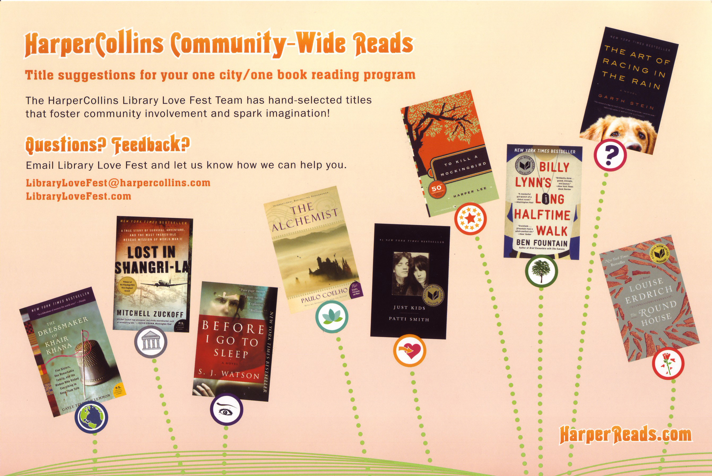
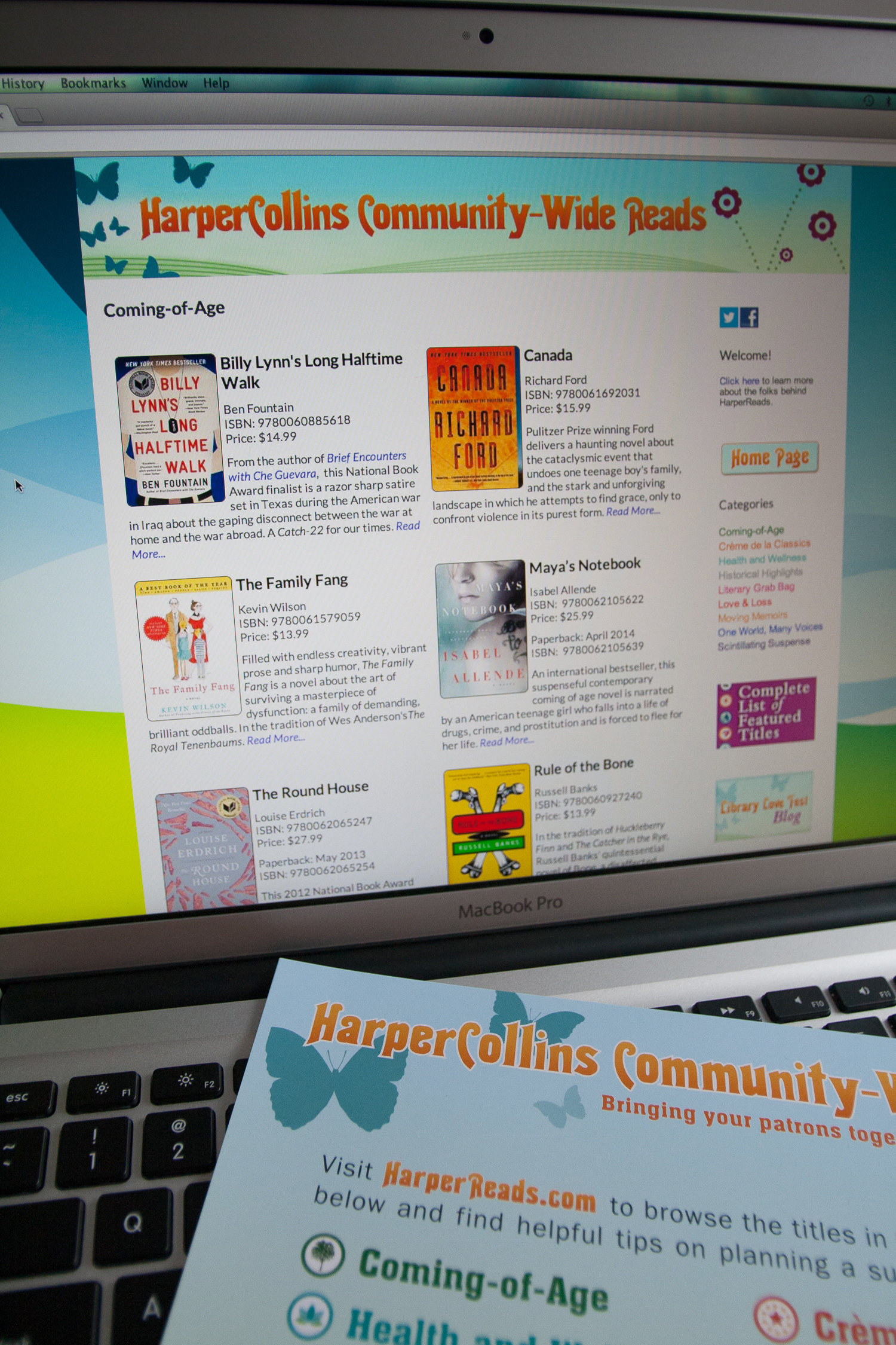
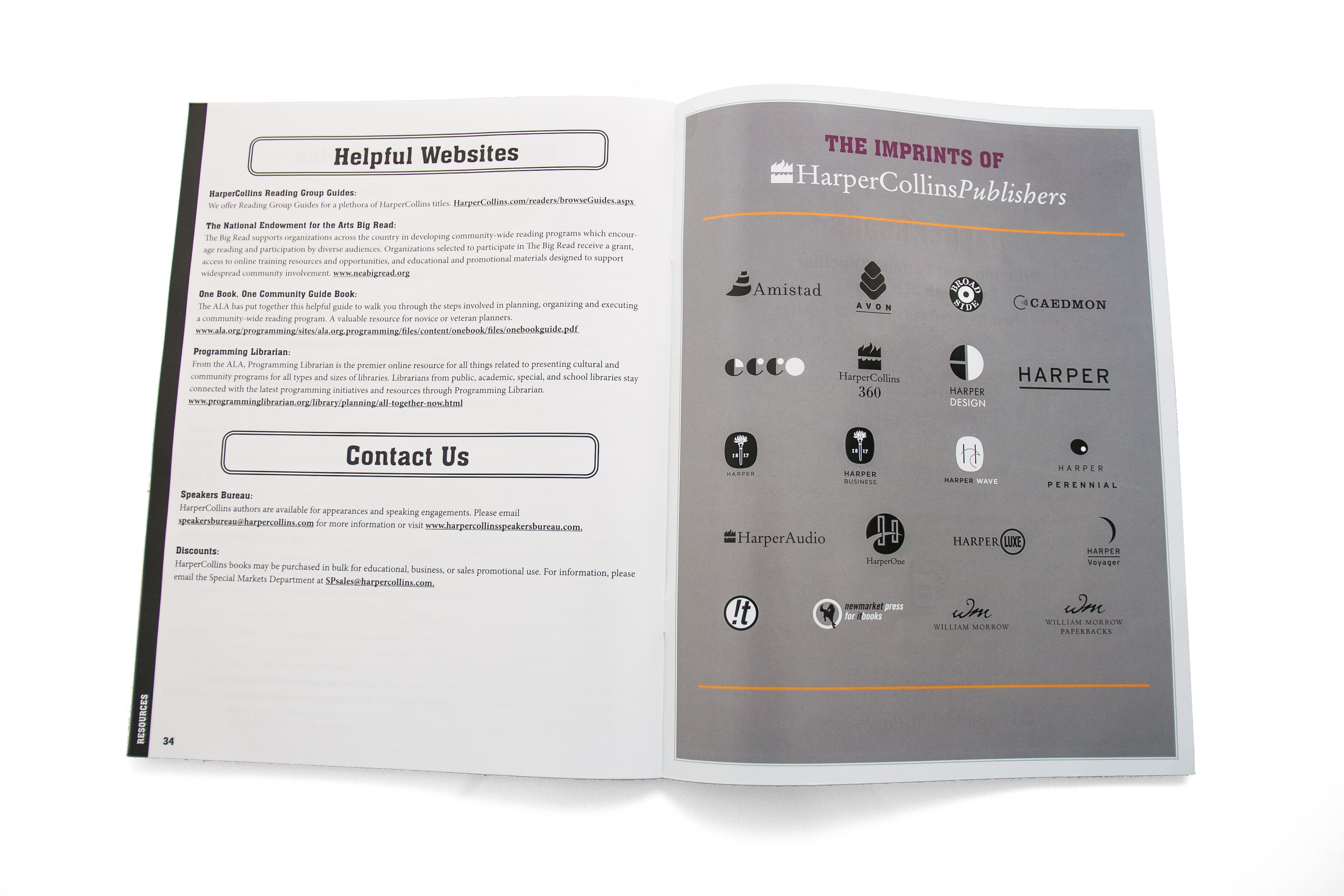
The next phase of this project involved creating a 32-page print catalog of the selected titles for distribution to Library Staff nationwide both in mailings and in-person conference handouts. This used the above developed branding that complemented the existing Library Love Fest branding, all into a printed, organized format.